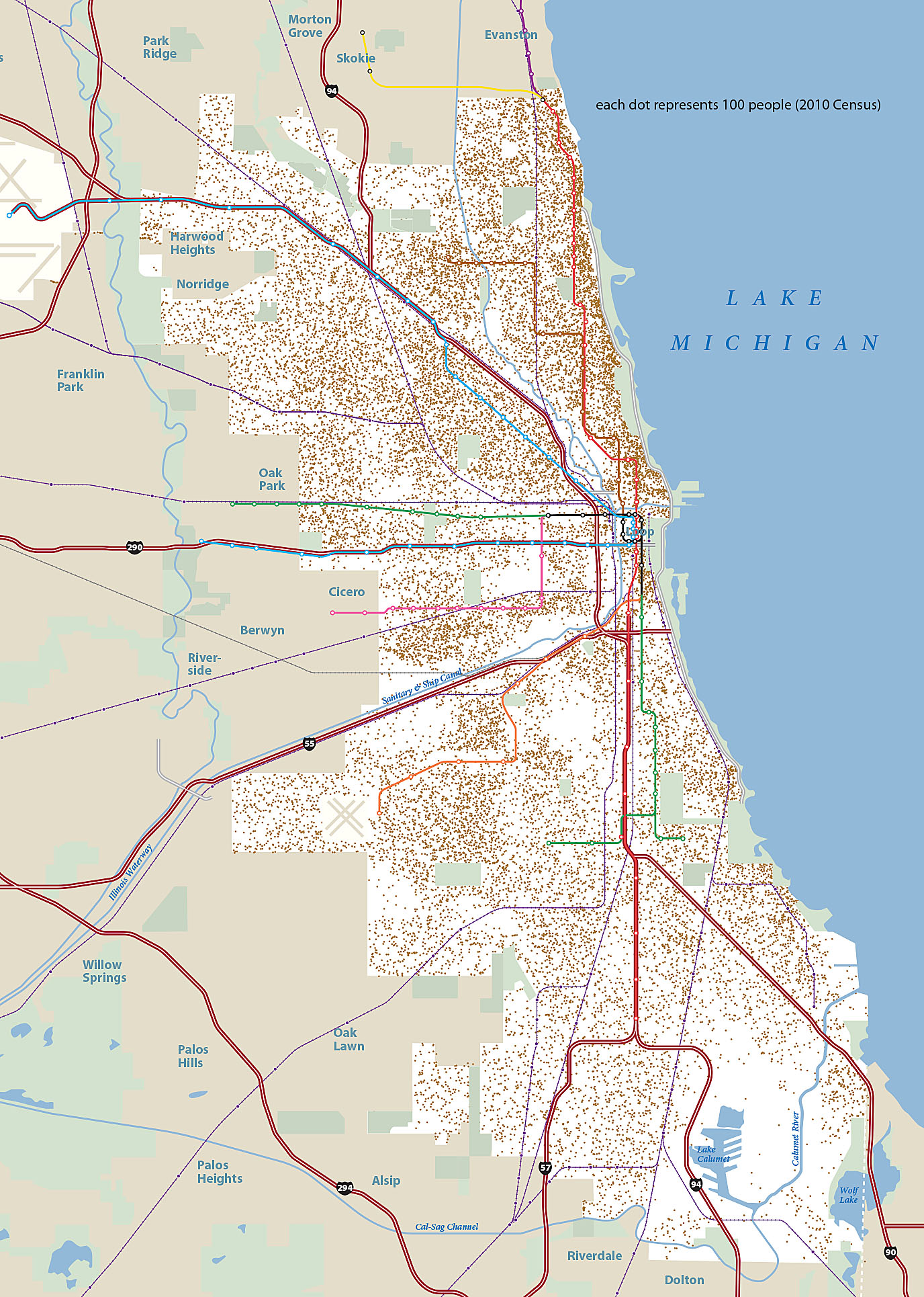
A dot-density map shows where Chicagoans lived in 2010 in relation to rapid transit lines (dark red). Based on 2010 census block groups. Each dot represents 100 persons.